Building a brand as alive as Lawrence.
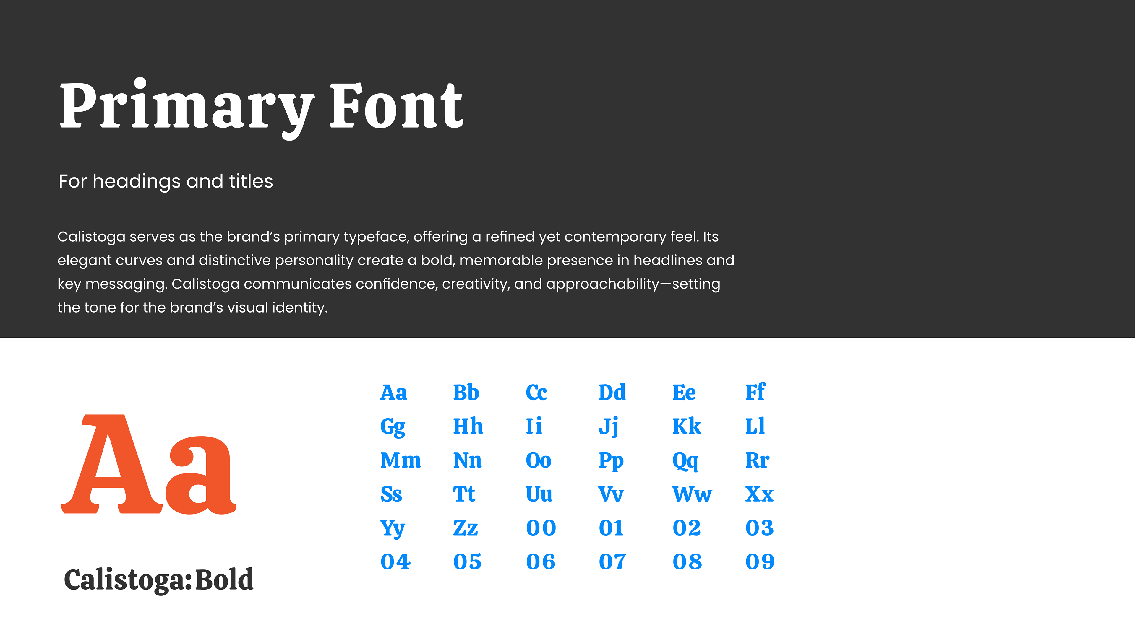
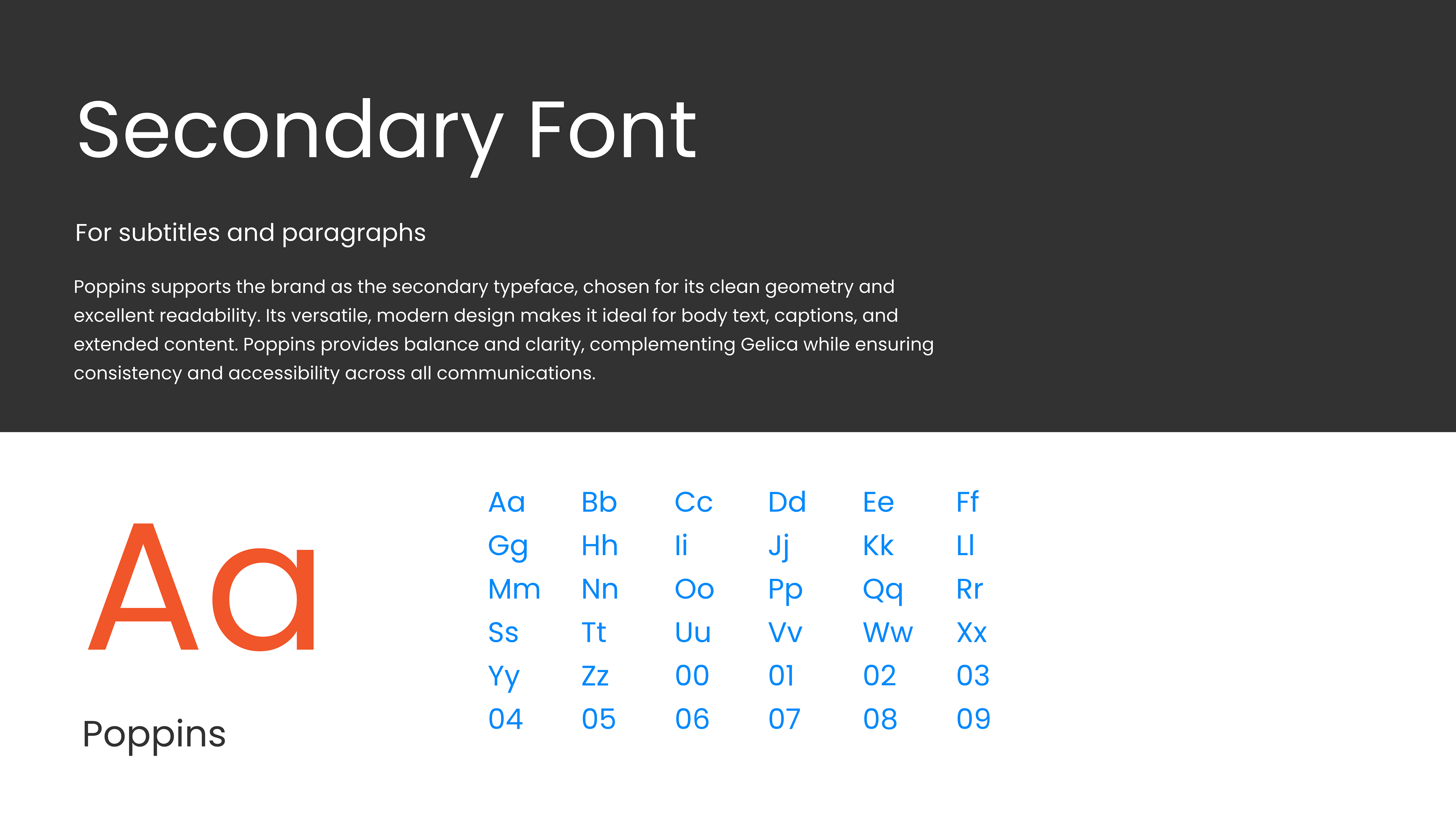
A full organizational rebrand for Lawrence CommunityWorks — logo family, color and type system, brand guidelines, photography, and a new website — designed solo, for a network of neighbors who don't see themselves in most institutional design.
Tools
Illustrator, Photoshop, Lightroom, Premiere Pro, Wix, Constant Contact, After Affects

The Challenge
A visual identity that didn't yet match the community it served.
Lawrence CommunityWorks is a grassroots network connecting residents of Lawrence, Massachusetts — one of the highest percentage Latino cities in New England — to housing, economic development, and civic programs across eight departments.
The existing identity wasn't reflecting the energy, pride, or diversity of that community, while it still had to read as credible to funders, city government, and regional partners. The brief was to build something that felt as alive as the people in it, without losing the professionalism the organization's institutional relationships depend on.
I owned the project end-to-end — no outside agency. Strategy, logo system, color and type, the full guidelines document, community photography, video, and the website rebuild all came out of one seat.

Strategy
Three decisions the brand is built on.
App-store ads and B2B decks need a different kind of design logic than a community brand does. Here, every major decision traced back to one question: what would actually make a Lawrence resident feel like this belongs to them?
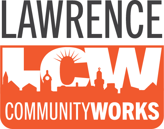
A skyline, not an abstraction
The mark places the LCW letters inside an orange rectangle with the Lawrence skyline cut into it in white — a civic symbol that's immediately local and owned, not a generic nonprofit swirl. It reads at a glance on a social post, a banner, or a t-shirt.

Real people, not stock photos
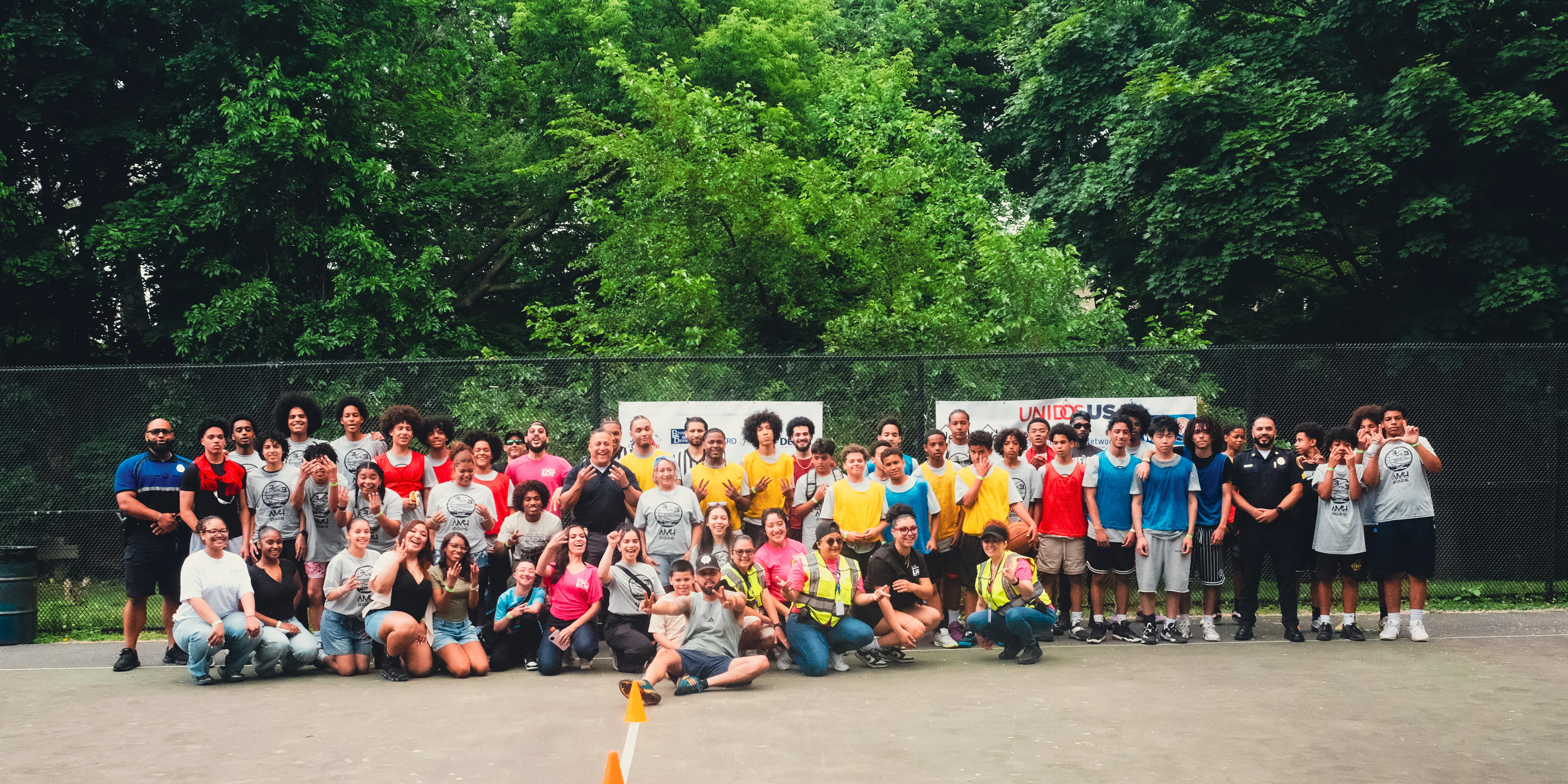
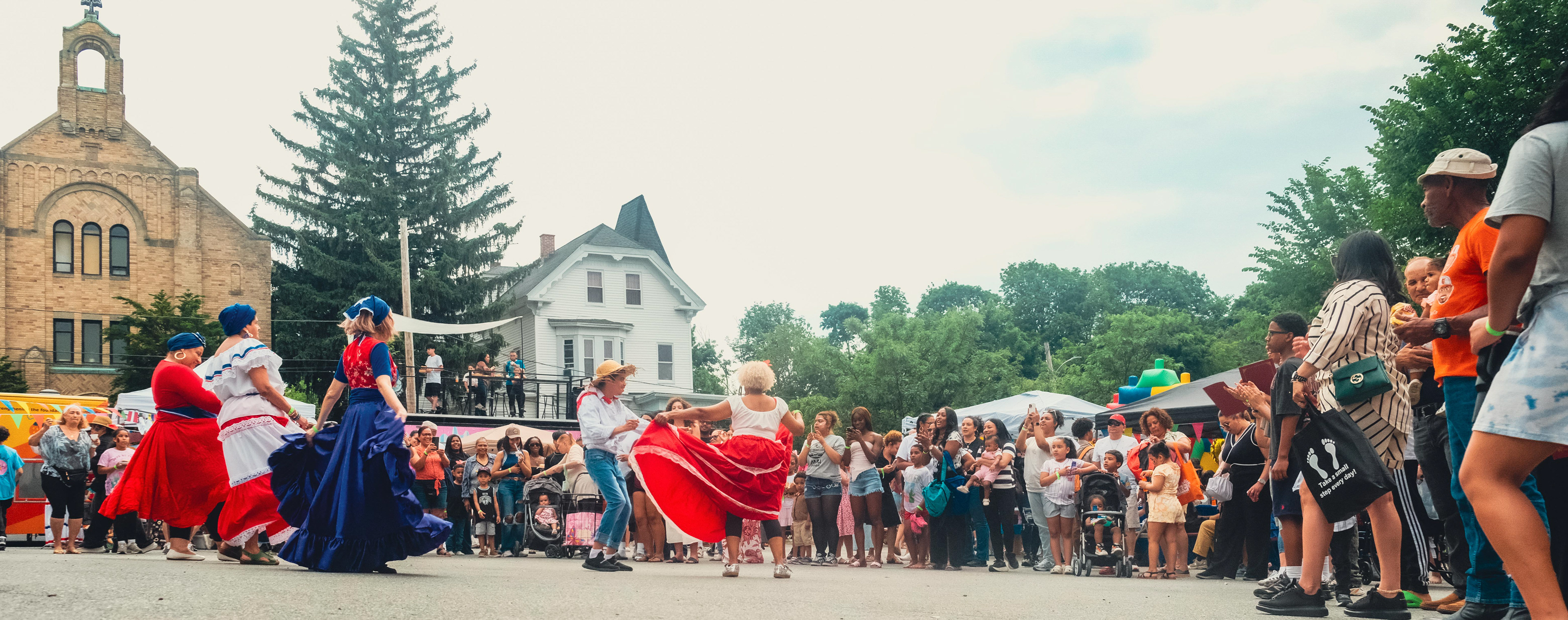
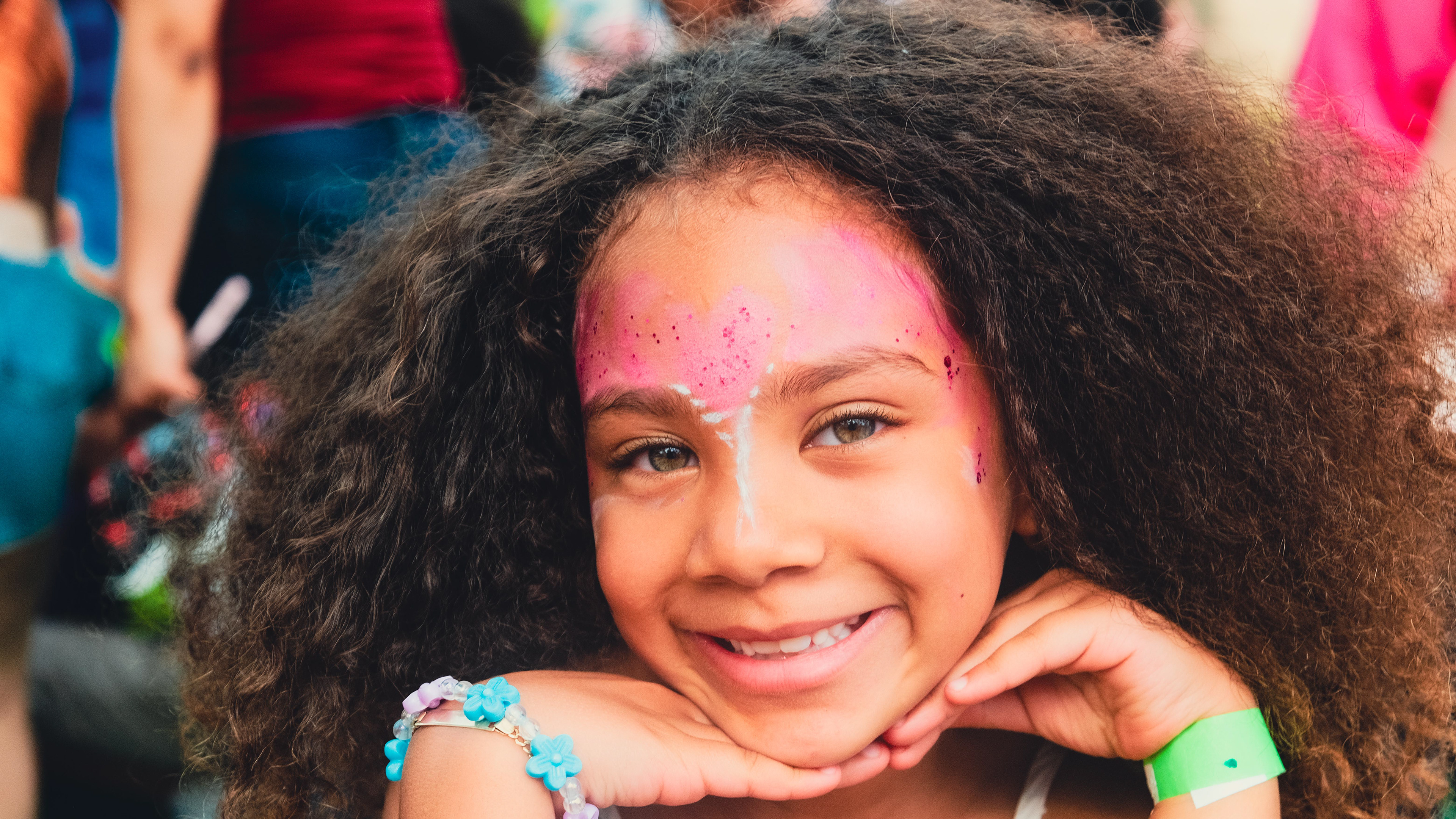
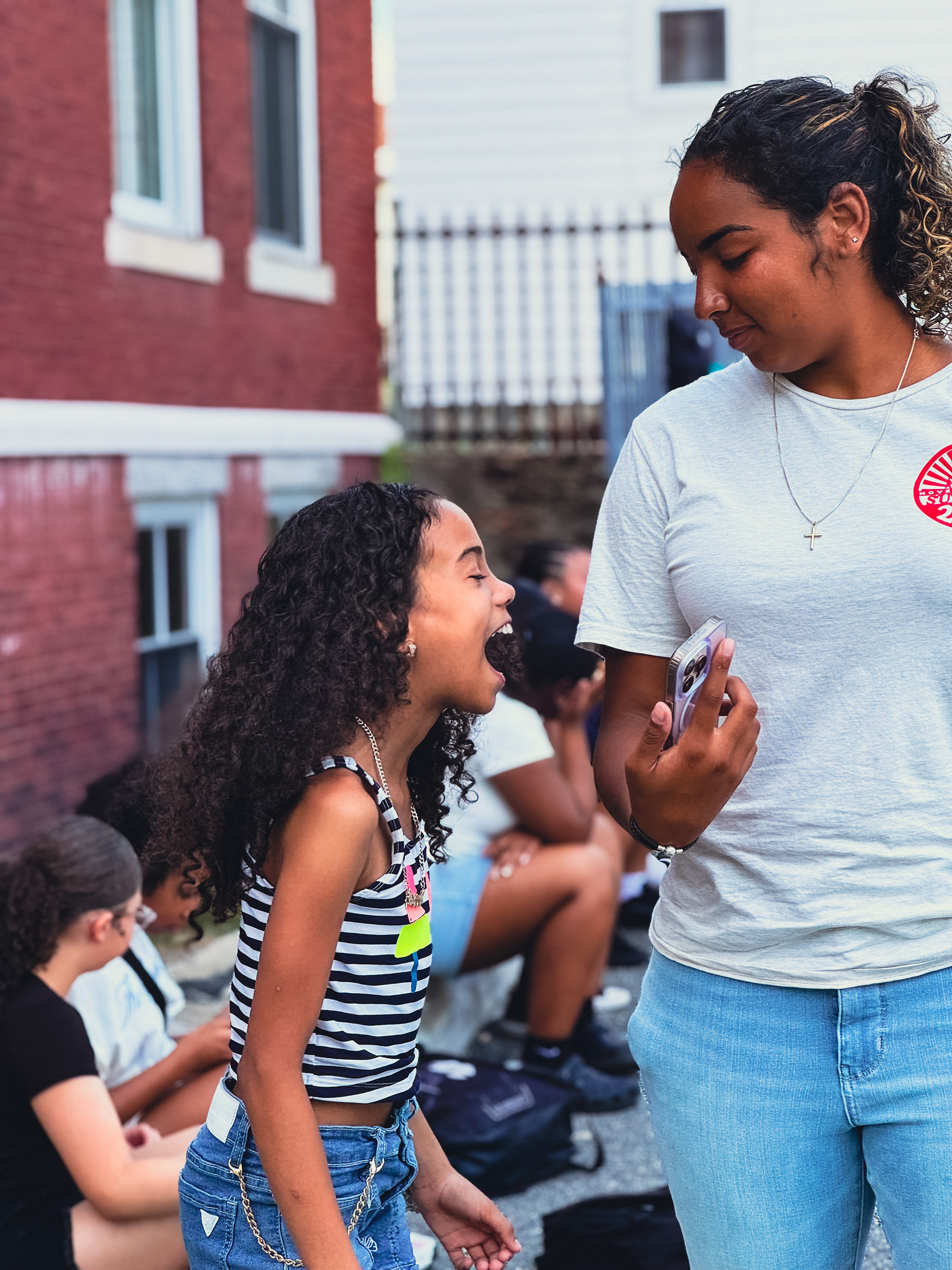
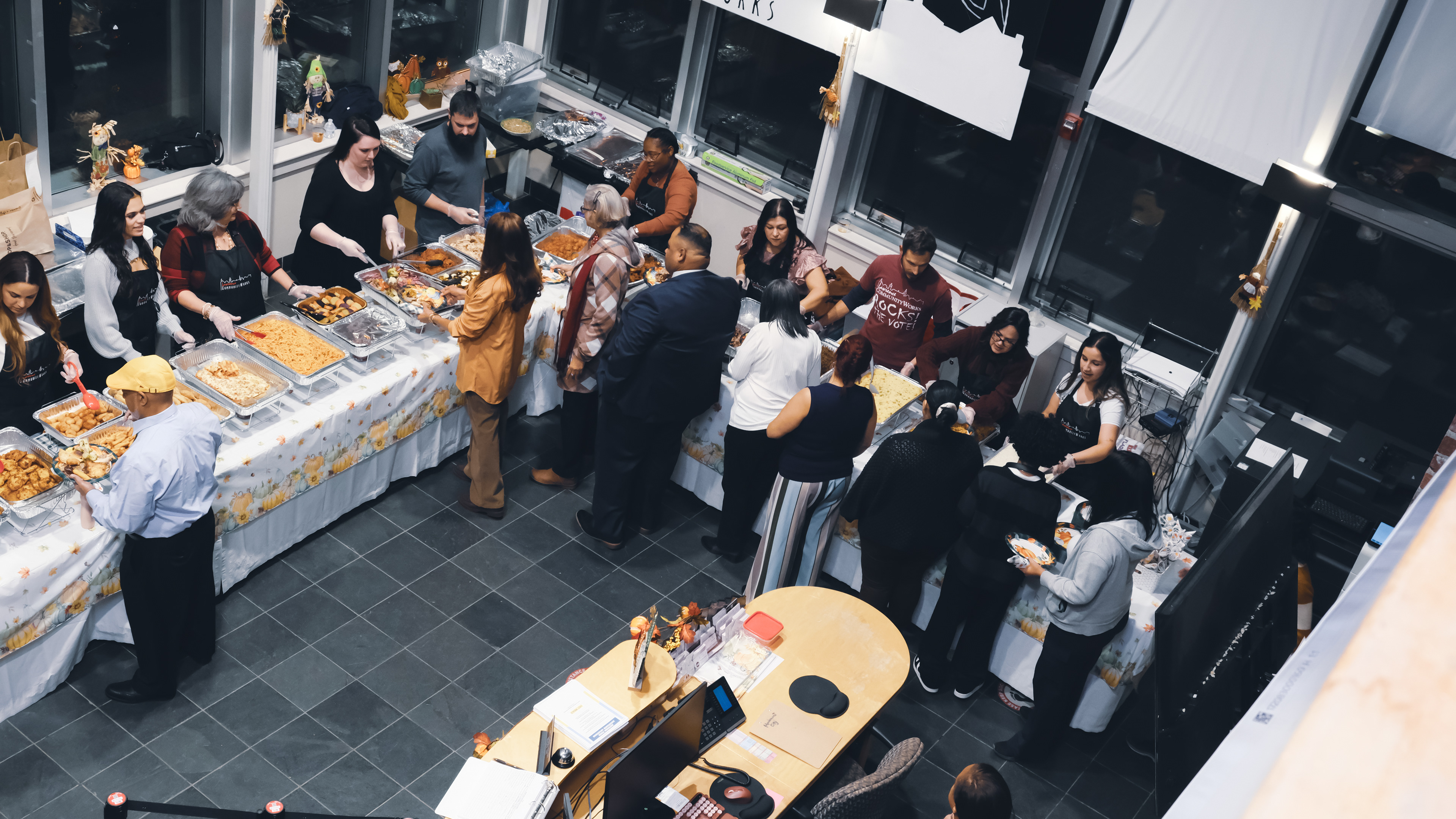
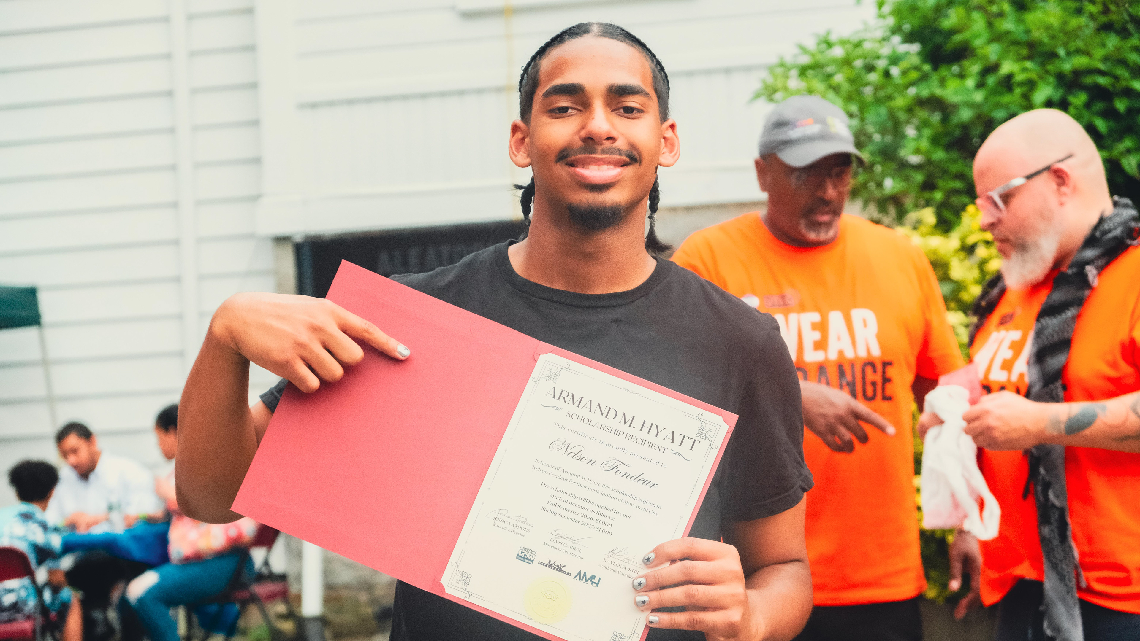
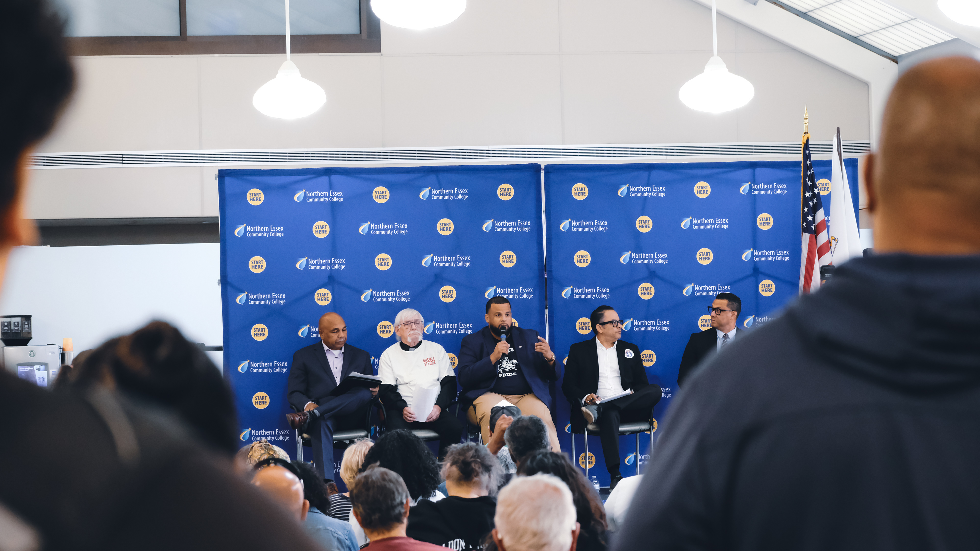
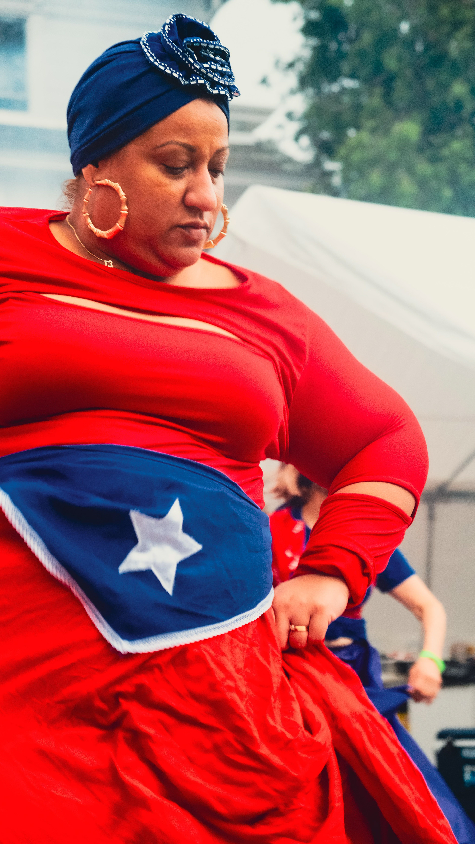
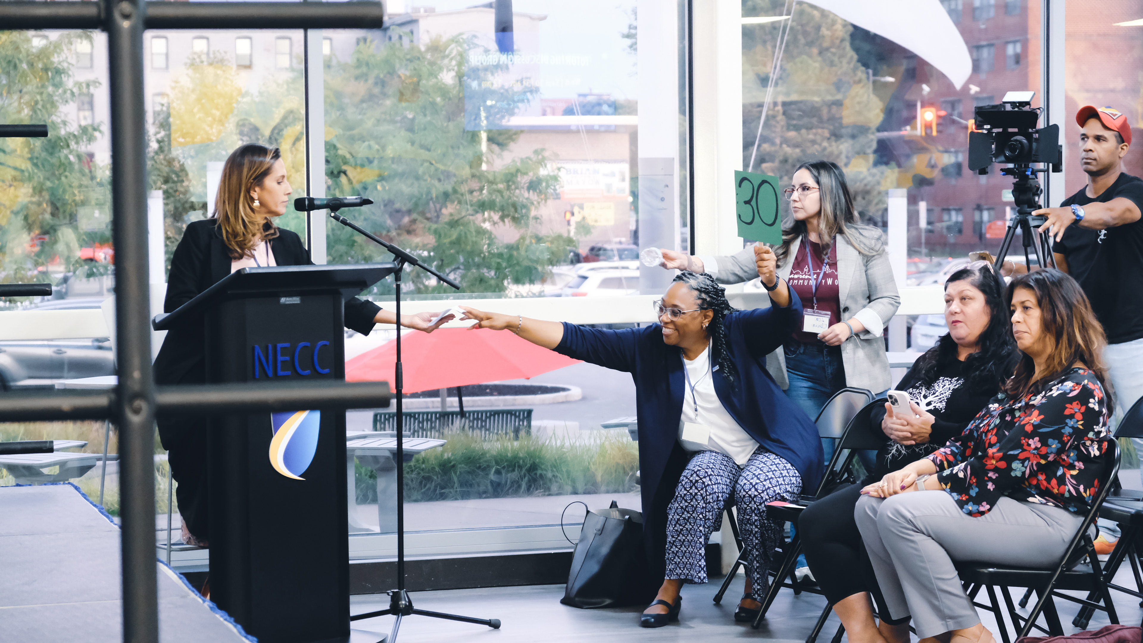
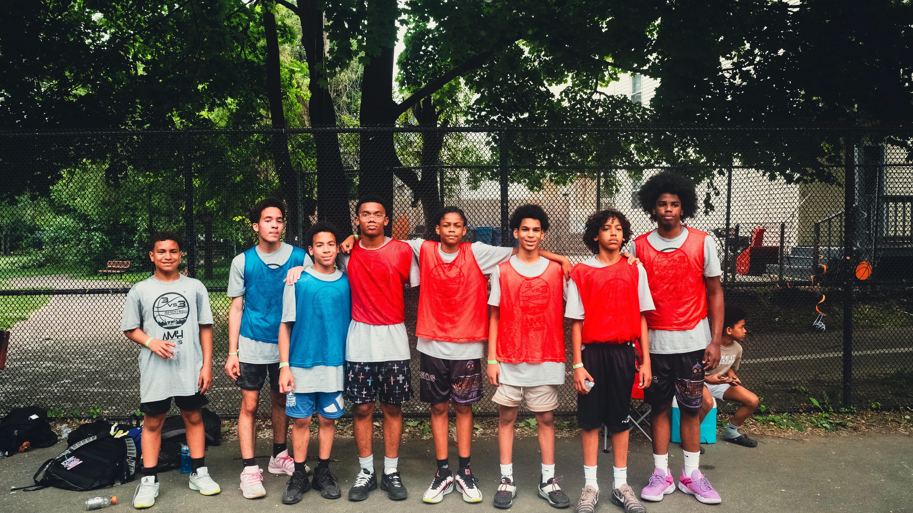
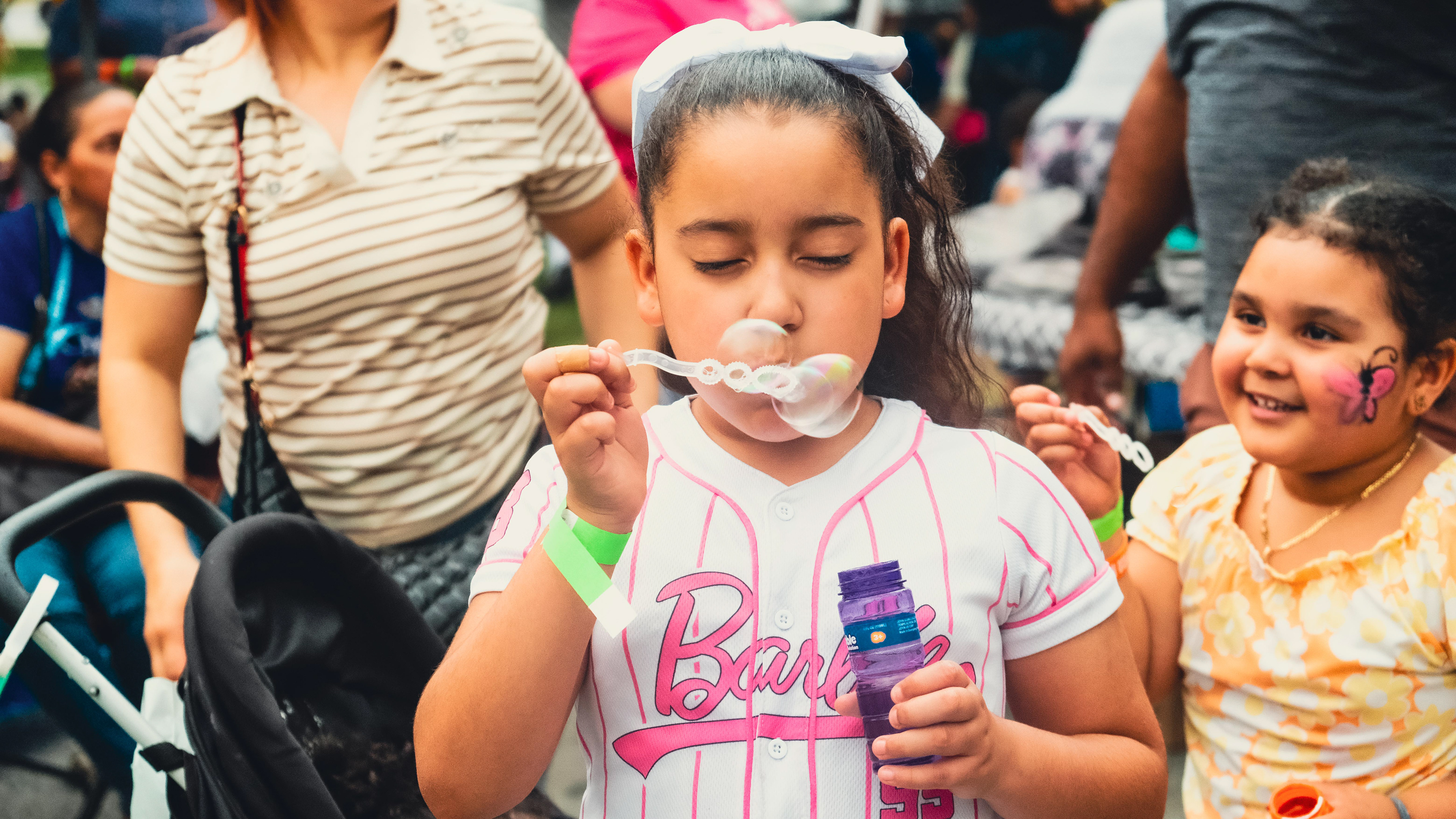
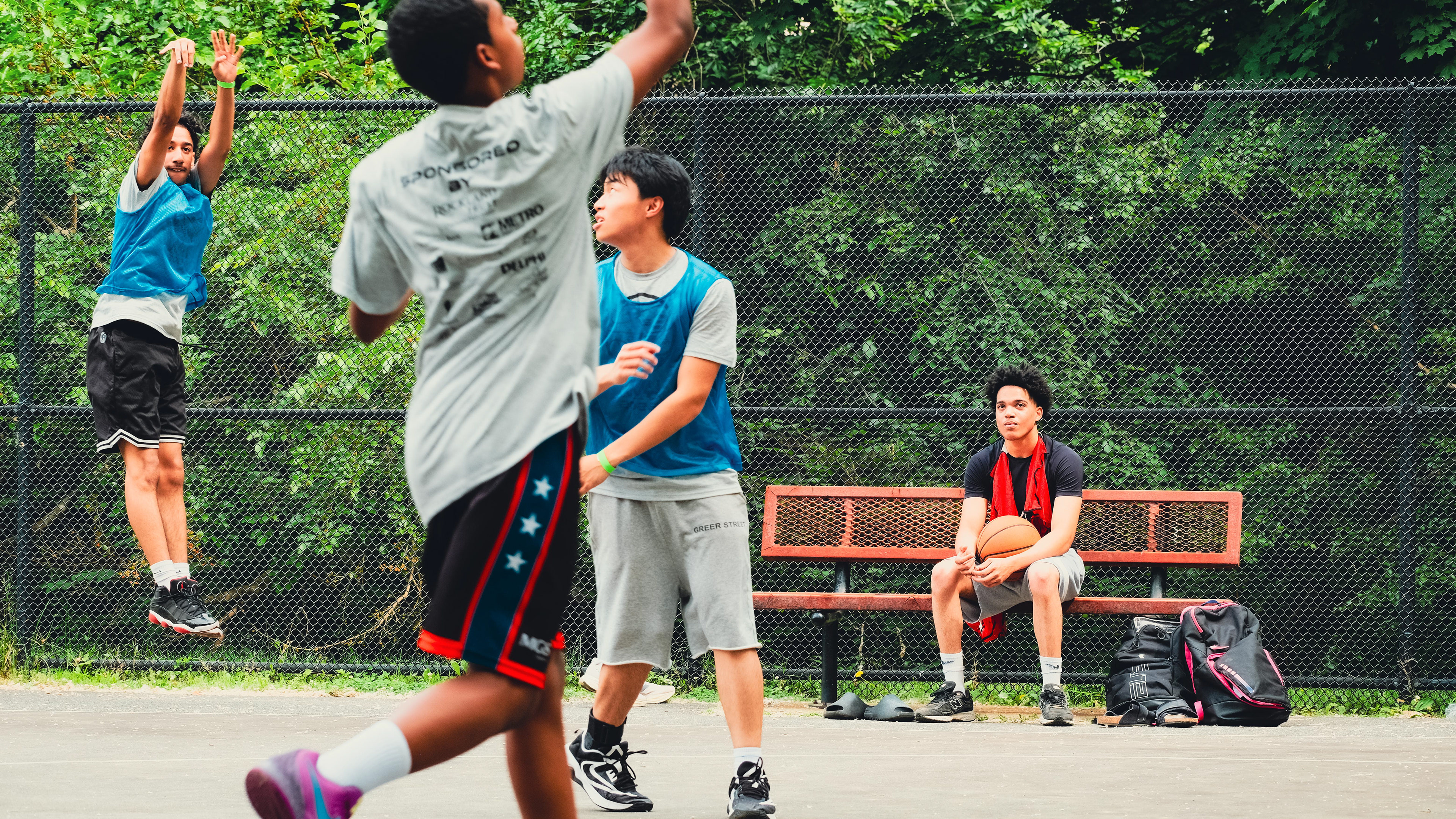
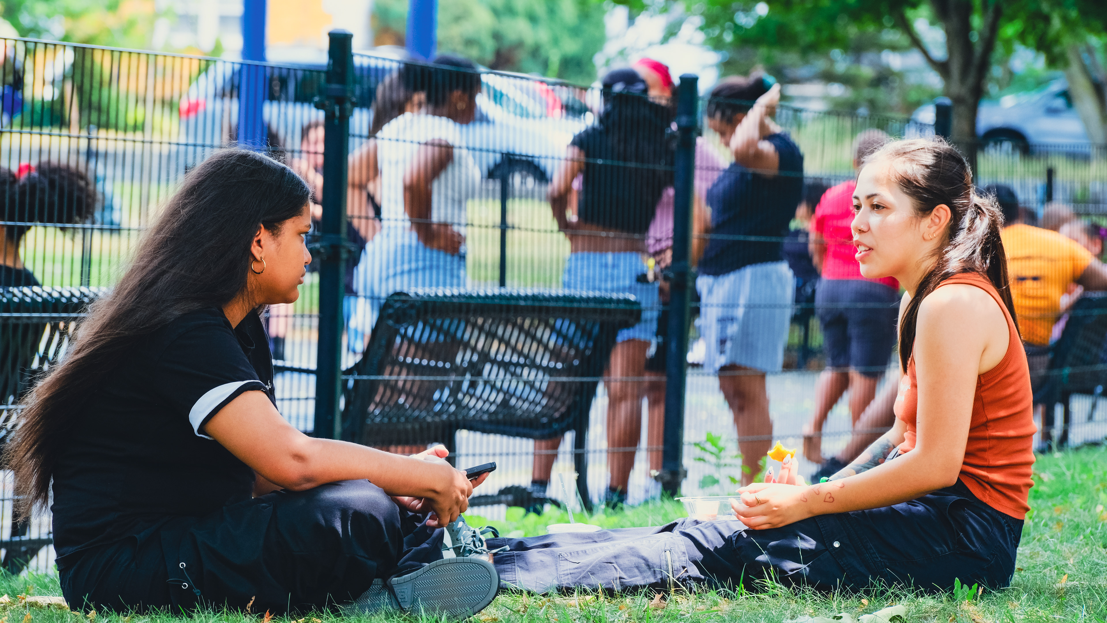
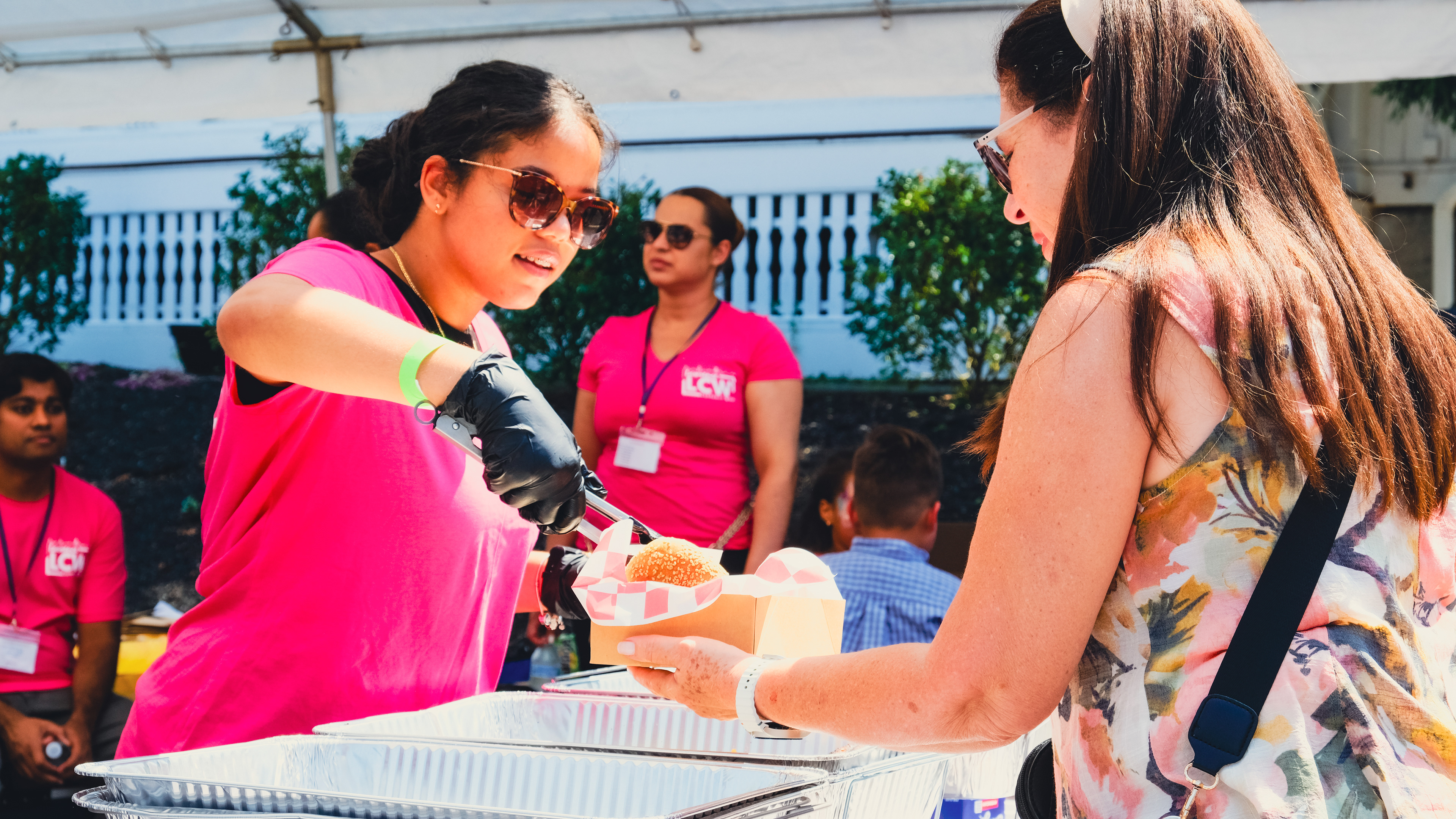
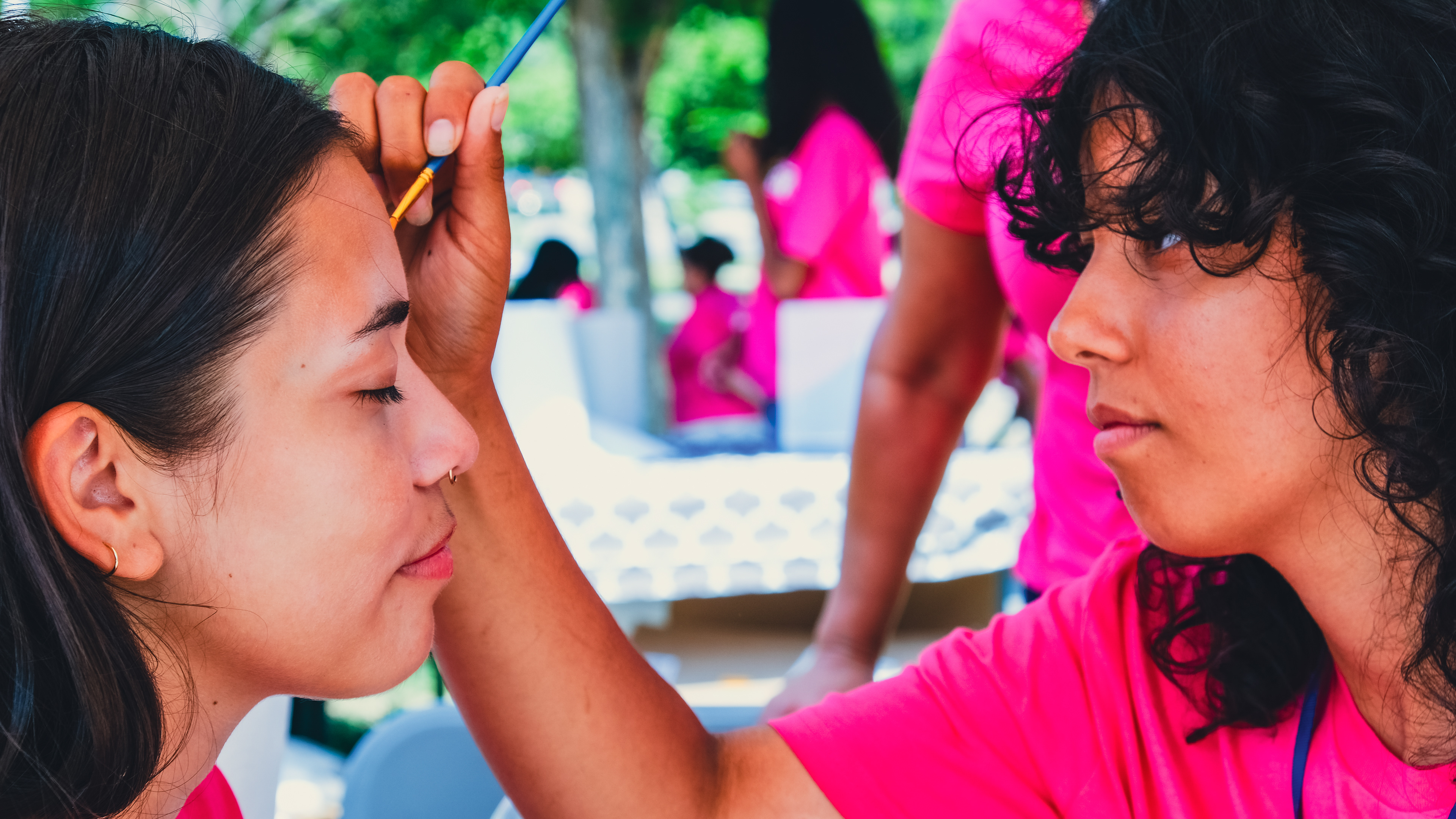
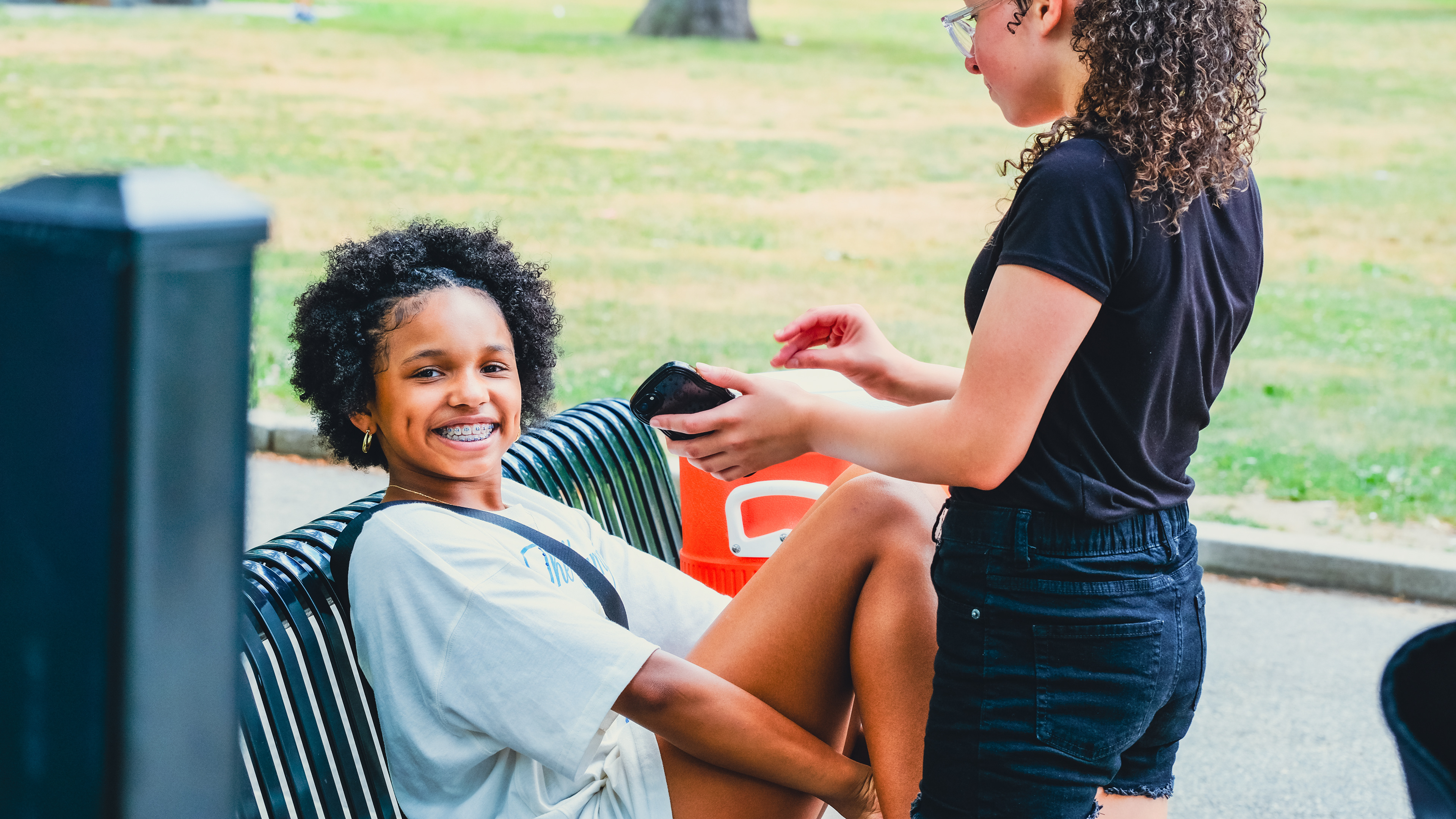
Nothing breaks trust with a Lawrence audience faster than imagery that looks licensed. I built an original community photography library first, so every other design decision had something real to work against.
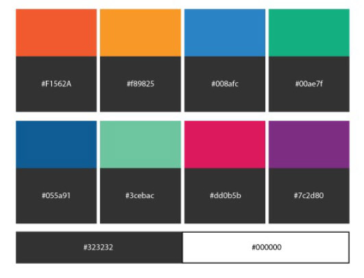
Ten colors, on purpose
Conventional brand wisdom says pick three colors. LCW has eight departments and a genuinely varied community, so the palette runs four primaries and four secondaries — one unifying orange, with room for each department to carry its own accent without fracturing the brand.
The System
What the identity looks like in practice.

Color System